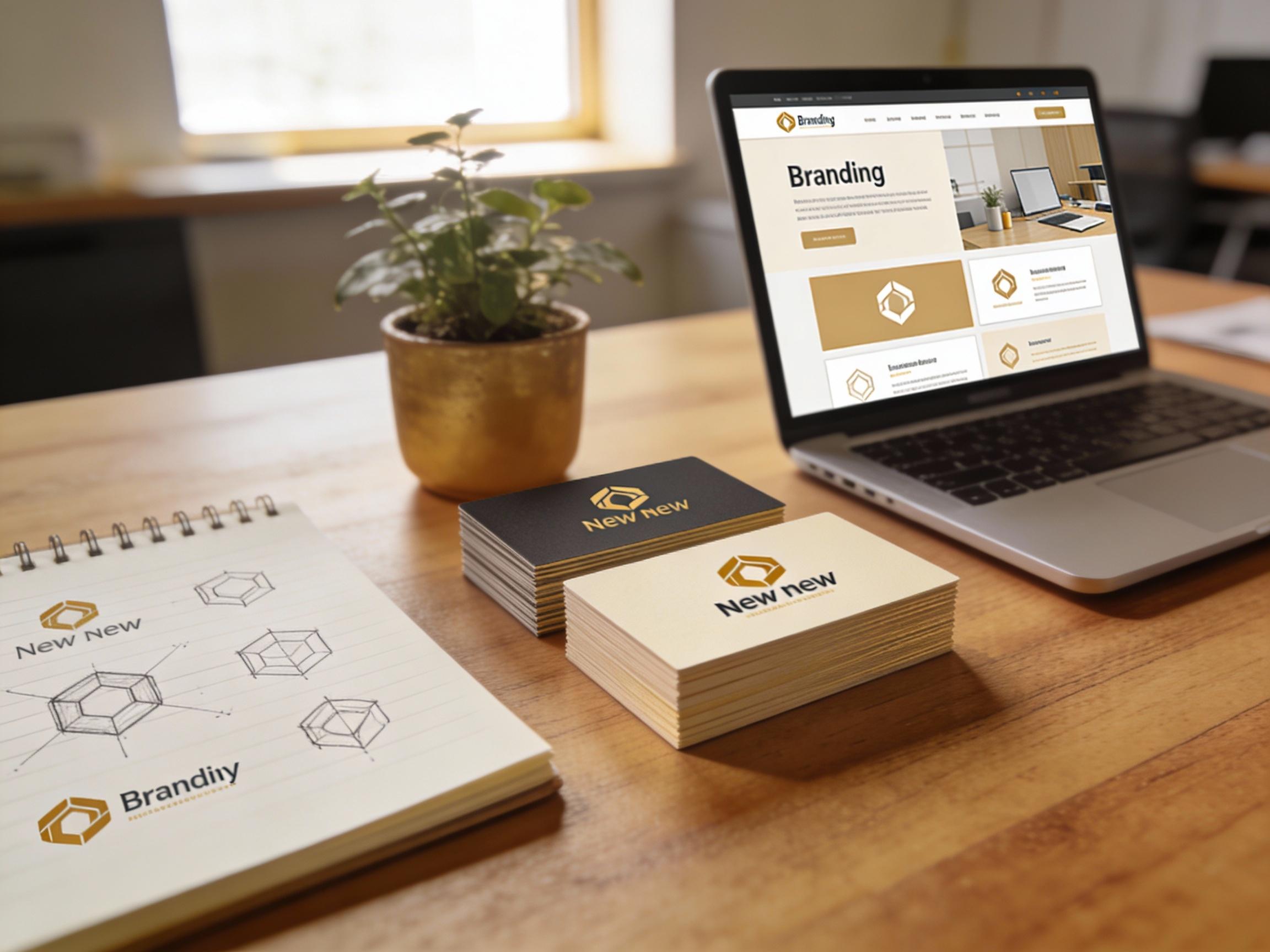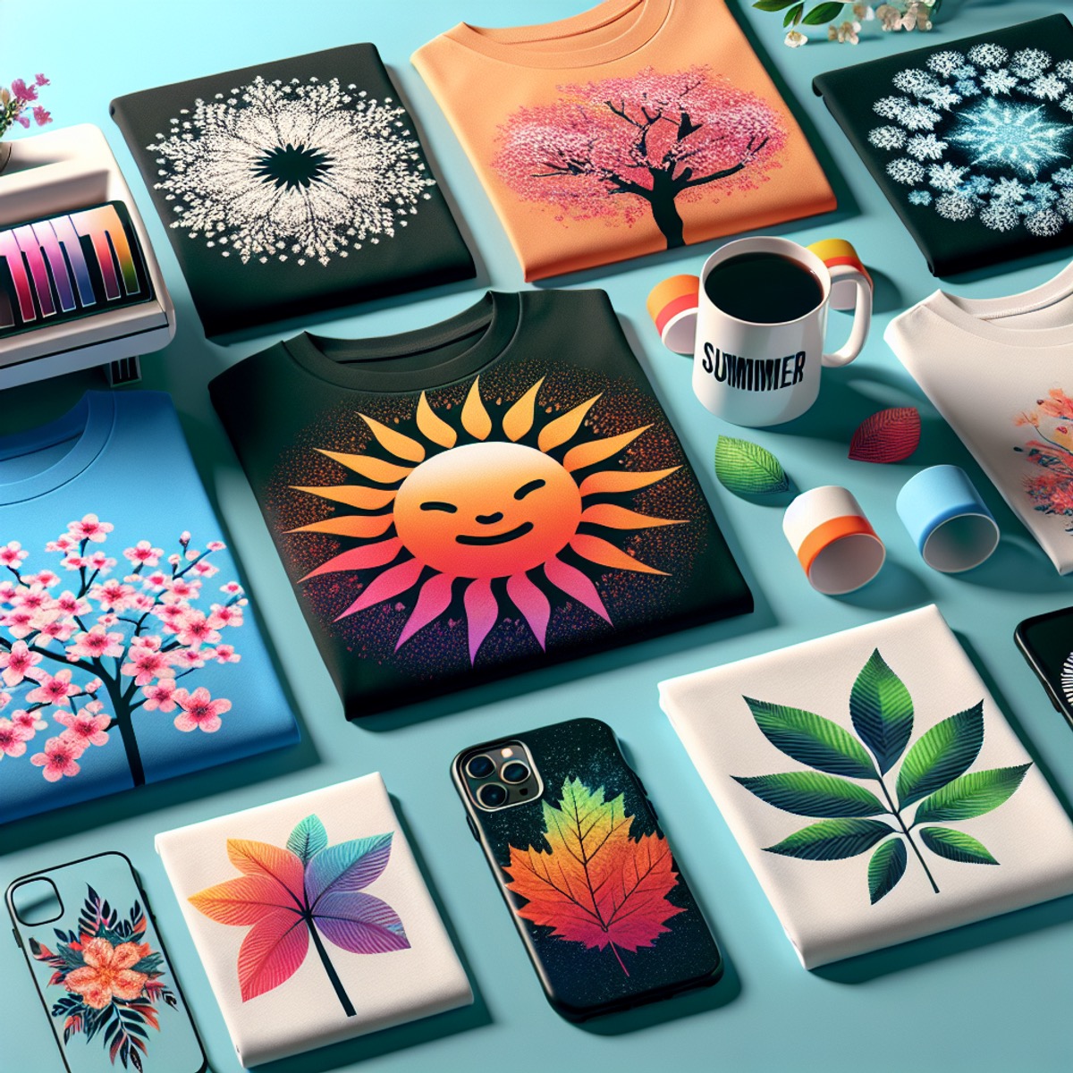
Colours are extremely important when you’re thinking of designing your printed items. Here we’ll look at a few colours.. what they mean and help you choose what’s best for you.
Red
If people are able to see energy, they’d probably see red. Red is the colour associated with activity, passion, romance, and adventure. This color is the eternal call to action. It has been proven effective in selling food and food supplements.
Yellow
Yellow is associated with feelings of happiness and good cheer. This colour suits the inquisitive and the playful. If you are perhaps into entertainment and amusement and intellectual stimulation, yellow is a good design colour choice.
Blue
The colour of calm skies is the colour that people associate with serenity and tranquillity. It gives off the feeling of distance and of perspective. The colour blue gives the person looking at it great reassurance. Blue offers the bonus of being the world’s least disliked colour.
Black
Black is generally associated with death and misery. It is also symbolic of mysterious, exclusive and traditional things. Use black sparingly in your design. Use it for accents, not as the main colour scheme. A little black here and there may give people the impression of stability and convention.
Purple
The colour of royalty, magic and wonder, this is purple. Children are inexorably drawn to the colour purple. It brings to mind the days of kings and queens, of lords and ladies, of princes and princesses. This is the colour to use if your target market is children.
Brown
Brown always evokes thoughts of nature and mother earth. Even if you are designing for an environmentally focused company though, using only browns without complementing colours would make your design look washed out.
Orange
This colour brings a youthful vitality to mind. Some people associate it with cheap and mundane things. Use orange if the brand is targeted towards young people.
There are many more colours to choose from and I can’t begin to cover everything in this article. Let’s take Lime Green for instance – seen to be the popular choice of leaflets or flyers for a long period of time. If you’re having an item created now – all we’re saying is – pay close attention to the colour scheme. As always – we’re here to help you make the right choice.