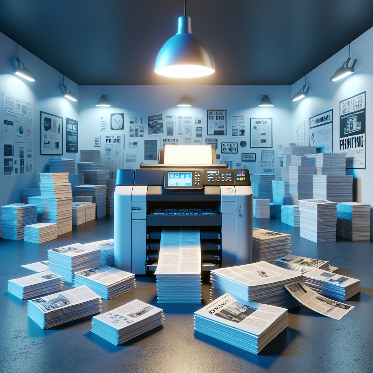
A while back I can remember a story of a customer who had designed their printed item (lets call it a leaflet for the benefit of this piece). The customer wanted to produce the piece themselves at home and send over a print ready file to their printer. A couple of days later the printer receives a phone call from the customer wanting to know why the printed leaflet doesn’t match her screen.
You see unless your monitor is of a very high standard or been correctly calibrated to display colours correctly – what you see on screen is sometimes way off what will get printed by a commercial printer.

Your screen is set up to display colours out of RGB (Red, Green & Blue) your print should be set up in either 4 colour process (CMYK – Cyan, Magenta, Yellow & Key/Black) or Pantone spot colours. Along with the way the colours are represented – the contrast and the brightness also plays a part in how you see the colours.
The second obstacle is that a desktop printer isn’t set up to deliver the correct colours to you either. What you see on screen and what you print out via your desktop printer – won’t be the same as what a commercial printer will produce.. I can hear you all shouting at me “But my printer has CMYK inks in it” which is start. But printers and repro houses constantly calibrate and check both their monitors, proofing machines (large printers) and presses to maintain colour consistency to a required standard.
So if you’re designing your own piece of artwork – it’s always good to see a hard copy or colour proof to make sure you’re happy with what will be printed (of course in the larger scheme of things there is always some movement inherent in the printing process and some of it also depends on what you’re printing on the same sheet – but this is a whole other post!
See you again soon
Rich


