Our new gadget
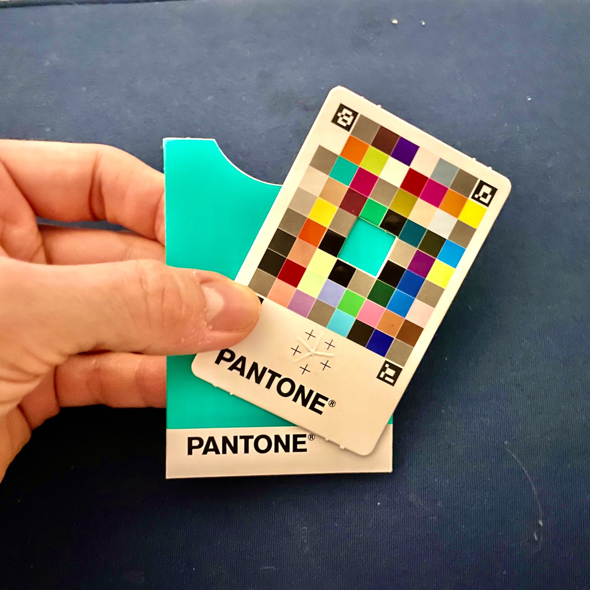
A few days ago I noticed an Instagram sponsored post for a new mobile colour measurement tool. It’s called the Pantone Colour Match Card. Ideal for people on the go who need to match physical surface colours to a Pantone reference. Let’s say you’re with a client and they have a previously printed version of […]
Pantone Reveals Color of the Year for 2014
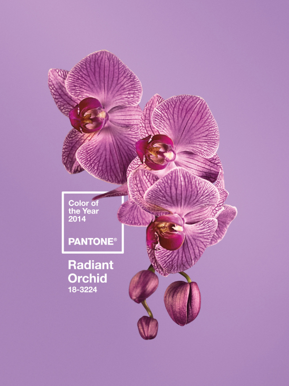
Pantone, an X-Rite company and the global authority, announced PANTONE® 18-3224 Radiant Orchid, a captivating, magical, enigmatic purple, as the colour of the year for 2014.
The Proof… is in the file
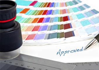
We had some queries on proofing this week and as such I thought I’d clarify the different types of proof out there and the impact they have on cost or your job.
Monitors – why you shouldn’t trust them!
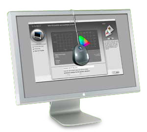
A while back I can remember a story of a customer who had designed their printed item (lets call it a leaflet for the benefit of this piece). The customer wanted to produce the piece themselves at home and send over a print ready file to their printer. A couple of days later the printer […]
PANTONE UNVEILS 336 NEW COLORS
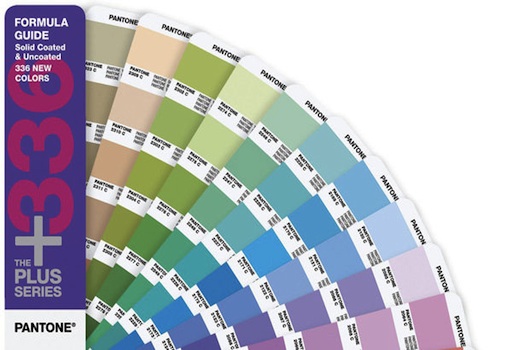
On Thursday 26th April, Pantone, the global authority on color announced the addition of 336 new shades to the Pantone Plus Series, bringing the grand total to 1,677 colors.
Passing a Job on Press
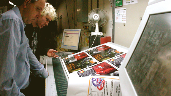
Or Press Passing as it’s known. It’s the method of checking a job while it’s being printed. We do this to ensure tight control to the job in hand – usually only done for large runs or brand specific/complicated pieces, either ourselves or the customer would check the following things.
What your Mum never told you about Proofing & Printing
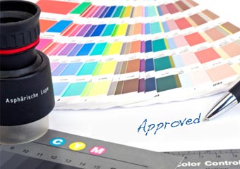
So you’ve placed your job with a printer, you’ve given them your file and you’re ready for the next step – you’ll most likely want to get a proof sorted for your artwork – so you are sure what you’re having printed is exactly the way you want it
What are Colour Bars…?
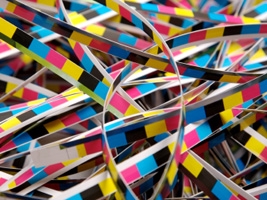
So following on from the registration post I thought I’d sort some info on what the other items on a printed sheet are. Today we’ll look at what colour bars are and what they’re used for…
What IS all the difference between prices…?

So you’ve been searching for the best quote you can find (naughty naughty, you shouldn’t be doing this… read here why!). You’ve got all these prices in from different printers and wondered why they’re so varied…! Well lets use a car analogy to try to help ease the explanation. A car is a car right? […]
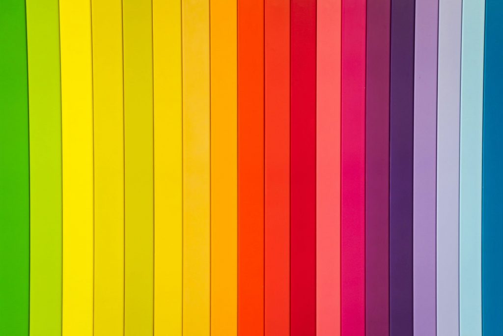
Colour me Good!
Colours are extremely important when you’re thinking of designing your printed items. Here we’ll look at a few colours.. what they mean and help you choose what’s best for you. Red If people are able to see energy, they’d probably see red. Red is the colour associated with activity, passion, romance, and adventure. This color […]