Pantone Reveals Color of the Year for 2014
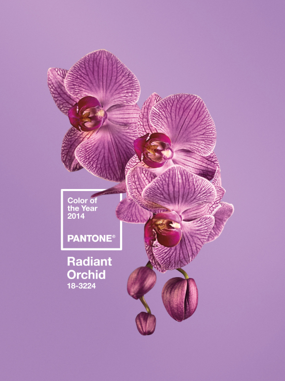
Pantone, an X-Rite company and the global authority, announced PANTONE® 18-3224 Radiant Orchid, a captivating, magical, enigmatic purple, as the colour of the year for 2014.
Colour Bars, Registration & Trim – What do they mean?
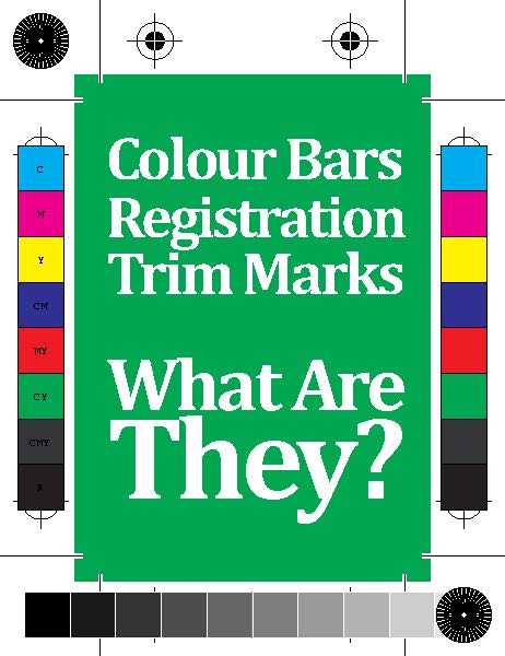
If you’ve ever seen an imposed sheet or a file ready for printing – you will have noticed a few marks in the white space around it. These marks are generally used on the larger sheet that we print on – not on individual files (apart from trim marks). So.. what do they all mean?
Augmented Reality – How you can use it in your printed brochures?
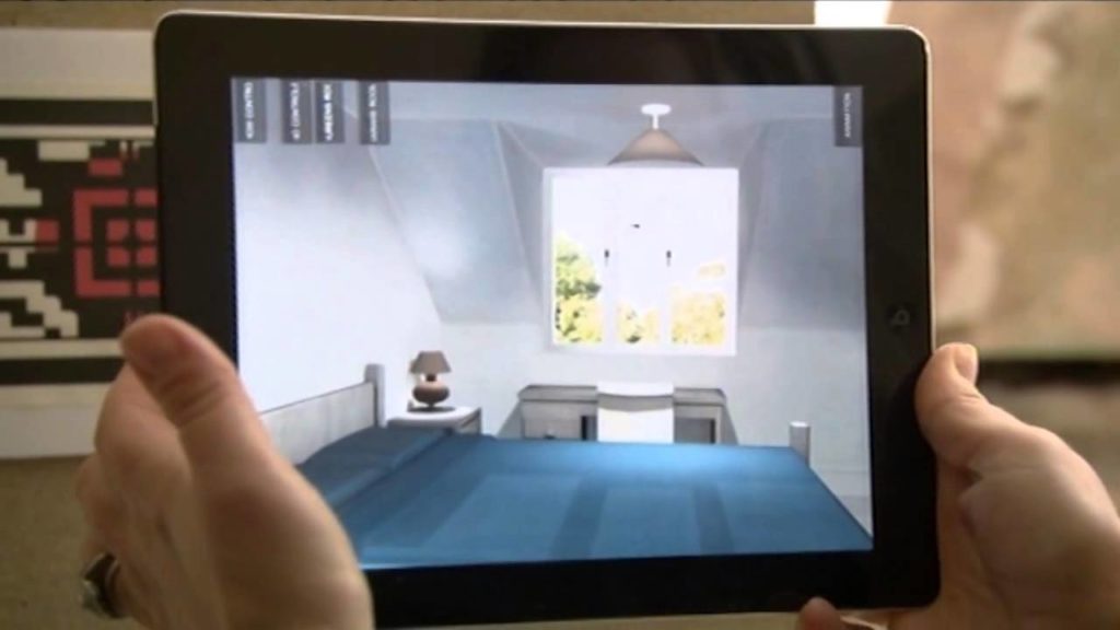
A great new market is opening up in the form of Augmented Reality. Most people will be familiar with the Moonpig advert on TV for their video cards. The principle is the same – but augmented can take it a little further – by bringing up (in some cases) the whole Hollywood Mountain right on […]
Digital Emboss
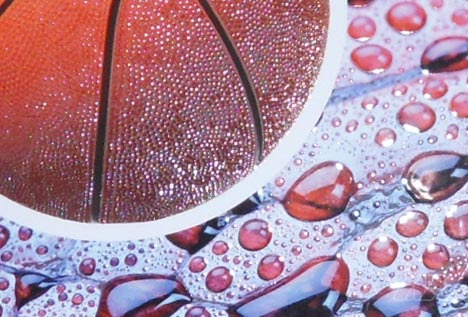
Digital Embossing Digital Embossing is the new sensation. This fantastic innovation makes print positively three dimensional. From today ‘ordinary printing will simply leave you feeling rather flat. Digital Embossing will make your message infinitely more compelling. It will make your printing no longer just a visual but also a sensual experience.
Monitors – why you shouldn’t trust them!
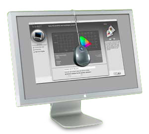
A while back I can remember a story of a customer who had designed their printed item (lets call it a leaflet for the benefit of this piece). The customer wanted to produce the piece themselves at home and send over a print ready file to their printer. A couple of days later the printer […]
What your Mum never told you about Proofing & Printing
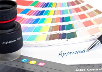
So you’ve placed your job with a printer, you’ve given them your file and you’re ready for the next step – you’ll most likely want to get a proof sorted for your artwork – so you are sure what you’re having printed is exactly the way you want it
Resolution

This one always seems to have the last thought when producing print. It’s most likely down to the computers we work on as to why it’s sometimes forgetton. Resolution is a very important part of printing and without a hi res image or text sometimes your item will look pixelated or fuzzy.Resolution is usually measured […]
Colour me Good!
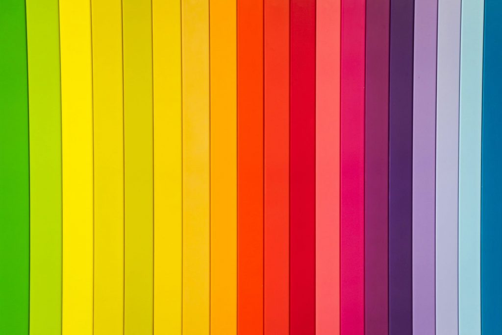
Colours are extremely important when you’re thinking of designing your printed items. Here we’ll look at a few colours.. what they mean and help you choose what’s best for you. Red If people are able to see energy, they’d probably see red. Red is the colour associated with activity, passion, romance, and adventure. This color […]
Such a Creep…
… If the title had you wondering, then don’t worry – this Blog post is all about a print term called ‘creep’ or push out or shingling or even feathering. If you’re not sure what creep is then i’ll try and explain that first. Imaging you’re printing a stitched brochure – a reasonable amount of […]
